GRAVII / FRONTEND PRODUCT SYSTEM
From scattered screens
to a product system.
Gravii turns on-chain wallet activity into Gravii ID and X-Ray experiences for individuals and wallet-cohort analysis for partners. I designed and built the frontend path across its landing, two apps, and internal operations surface—from entry and authentication to data and results.

Define the flows
before the screens.
Four apps share one brand, but their users, authentication, and data contracts differ.
The public landing explains the product and creates entry points. The user app gives wallet holders Gravii ID and X-Ray; the partner app supports wallet-cohort analysis; a separate surface handles internal operations. I joined feature and priority discussions, then translated these areas into information architecture and working user flows.
Four apps.
Boundaries by design.
My architecture work was to separate users, authentication, and API boundaries by app, then share only the contracts those apps need in common.
Each app owns its routing, feature modules, screens, and user flows. Domain types, API clients, and brand assets are shared across the frontend workspace.
DOMAIN TYPES · API CLIENTS · BRAND ASSETS
Wallet authentication for users and Google sign-in for partners remain distinct flows. The frontend uses product-specific public APIs rather than calling the internal analysis engine, keeping its responsibility on requests, states, and result presentation.
After sign-in,
real data had to appear.
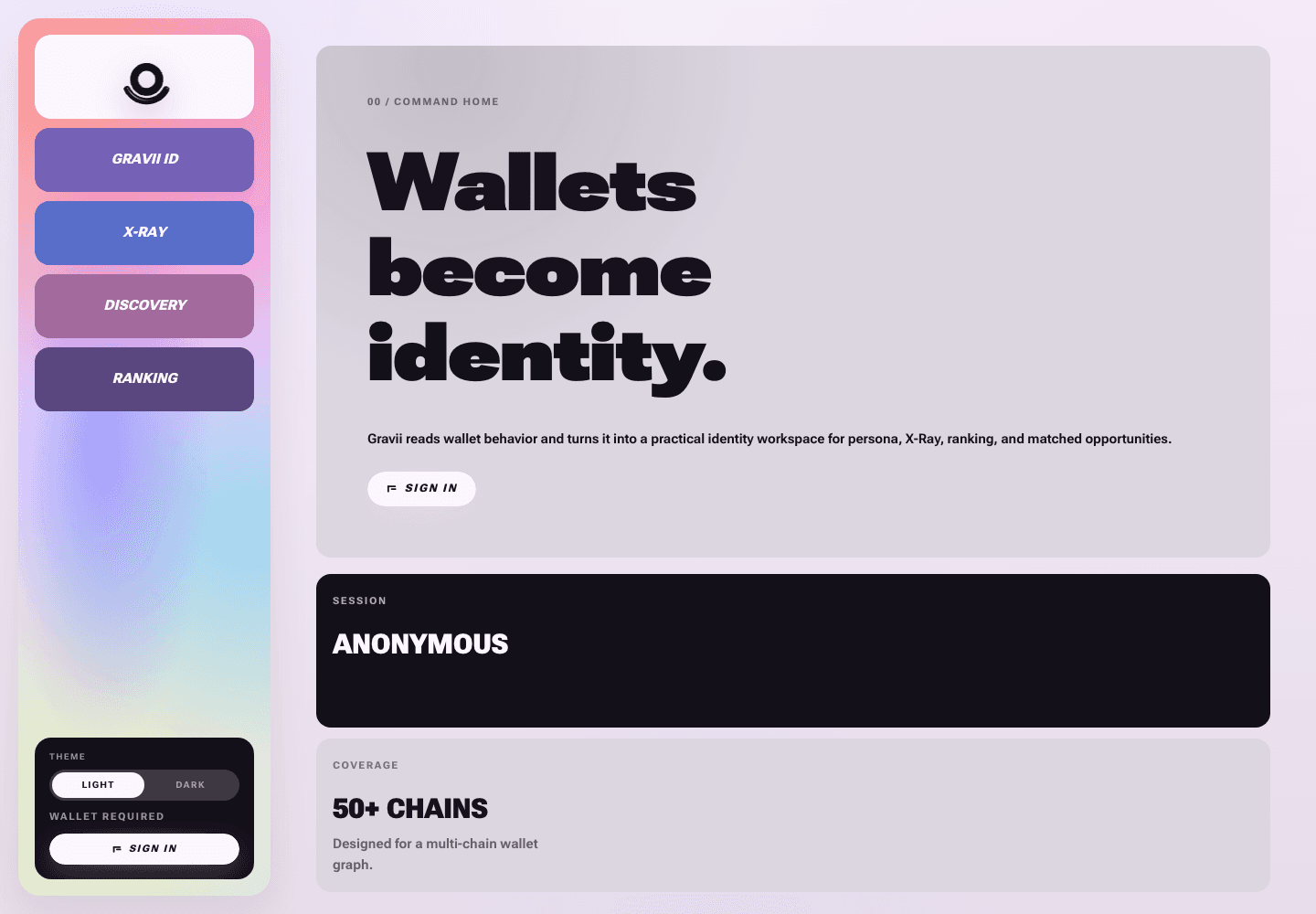
Wallet connection was only the start. Users needed to understand their ID and analysis results after signing in.
After wallet-signature authentication, the app reads Gravii ID from the User API and displays credits, X-Ray history, new analysis requests, and result details using real responses. I map API responses into screen models; browser requests pass through same-origin Next.js routes, with authentication tokens held in server session cookies.
I also designed the wait for a new wallet ID, in-progress analysis, insufficient credits, empty results, and errors. Discovery and Ranking are marked as not yet backed by live data; My Space remains in the code but is hidden from current navigation.
- 01 / ENTRYPublic landing to user app
- 02 / AUTHWallet connection, signature, and session
- 03 / USER APIGravii ID response mapped to the profile
- 04 / X-RAYCredits, requests, results, and states
From demo screens
to working flows.
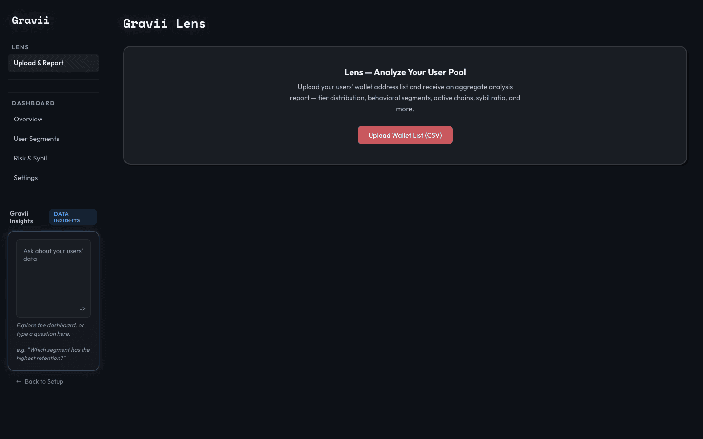
Lens turns a wallet list into an end-to-end analysis workflow.
Google sign-in and Partner API authentication determine the entry point from account status and plan. In Lens, CSV or wallet-address input is normalized into an analysis pool. Partners can follow progress, review aggregate results, and drill into wallet lists and individual analyses.
I implemented filtering, sorting, and pagination around that data structure. Authentication and Lens use live APIs; some dashboards and analytics screens are labeled as preview data.
- 01 / AUTHGoogle sign-in and Partner API
- 02 / INPUTNormalize CSV and wallet addresses
- 03 / LENSCreate analysis pool and track progress
- 04 / RESULTSAggregate to wallet list and detail
The landing is
the first product step.
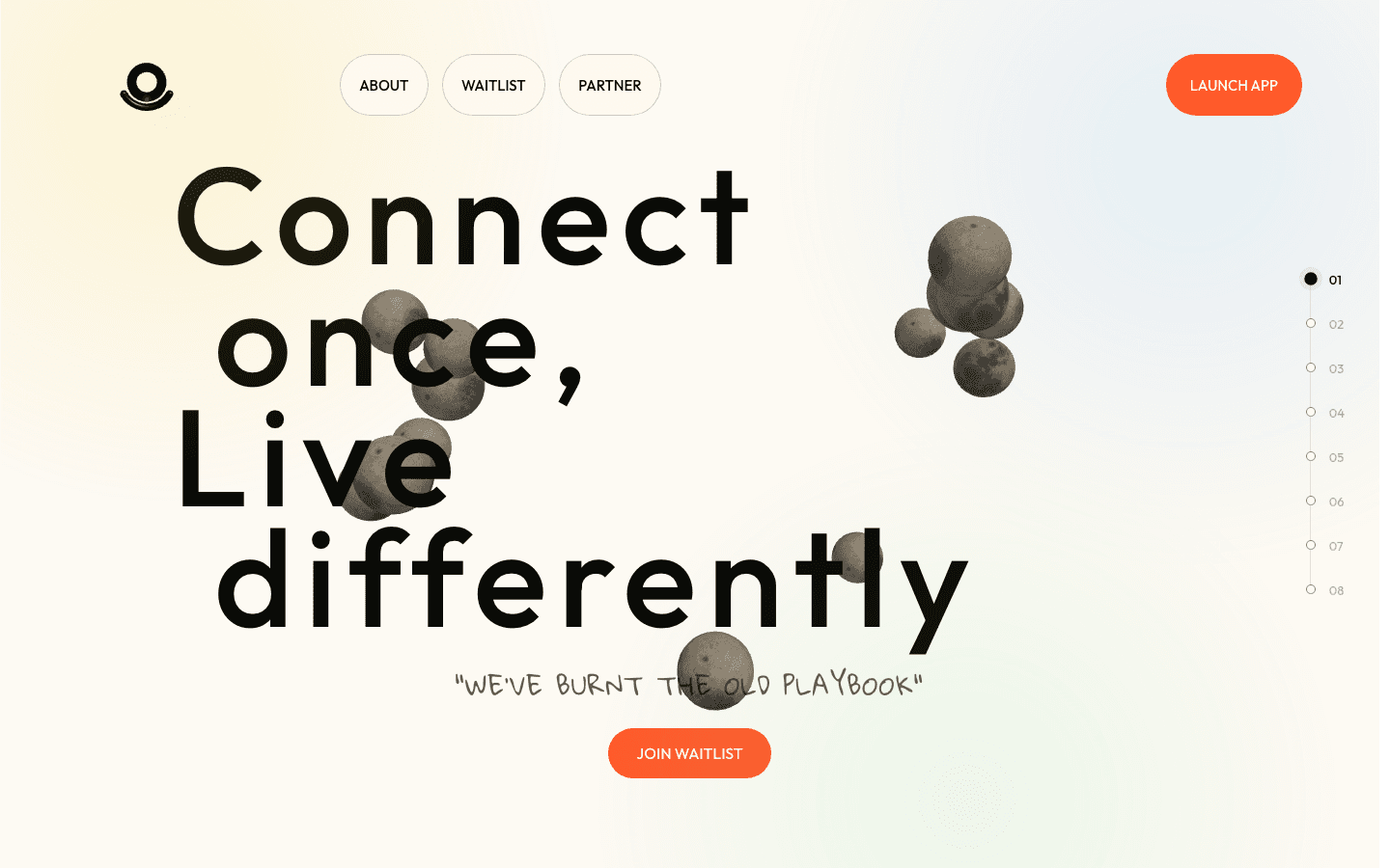
People need a clear next action from the first explanation through the authenticated experience.
I designed the public landing and partner introduction as entry points into their respective apps. The content first answers what individuals see after connecting a wallet and what partners get from a list of addresses. Waitlist registration and acquisition information are part of that journey. As priorities changed, I discussed them with the team and adjusted the screens and delivery order.
A visual language
that could be reused.
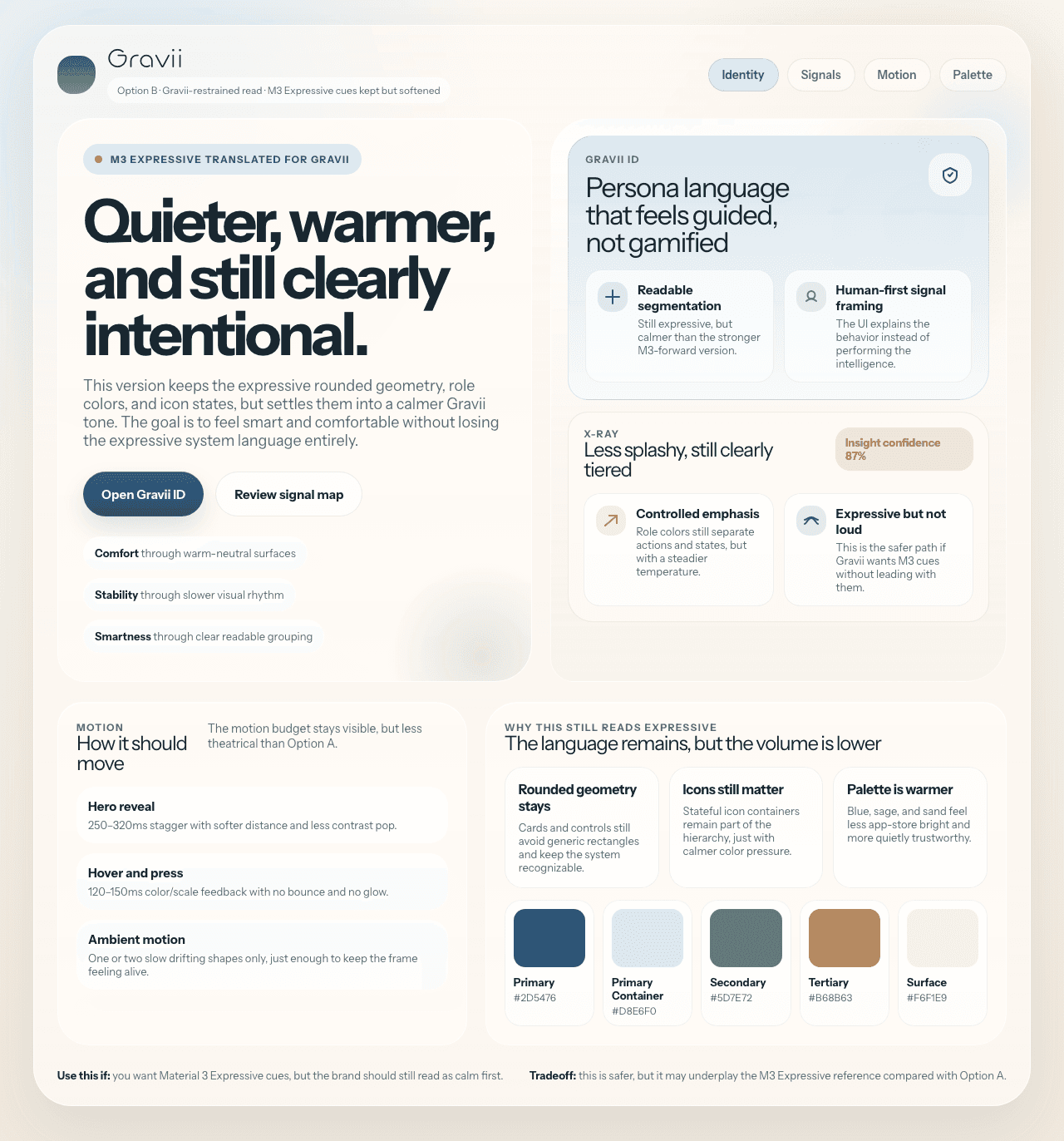
I designed and built for both brand expression and clarity inside data-heavy apps.
I documented color, typography, components, motion, and shared brand assets, then built responsive desktop and mobile layouts. Authentication, loading, empty, and error screens follow real API and product states. Design evolved alongside implementation as those constraints became clear.
Meaningful work
before launch.
I separated the responsibilities of the landing, user and partner apps, and internal surface while connecting their frontend architecture and data flows. Wallet authentication, Gravii ID, and X-Ray in the user app, plus partner authentication and Lens, use real APIs. The full product is still pre-launch, so I make no growth or conversion claims.
Visit Gravii's public site ↗